
Responsive Web Design: 50 Examples and Best Practices
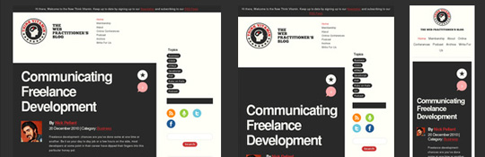
Responsive web design term is related to the concept of developing a website design in a manner, that helps the lay out to get changed according to the user’s computer screen resolution. To say more precisely, the designing the concepts enables the users to avail an advanced 4 column lay out, with the width of 1292 pixels, on a 1025 pixel width screen, that auto simplifies into 2 columns. Also it suitably fixes on the screen of smartphone and computer tablets. This particular designing technique is termed as “responsive web designing”. Full article
Source: http://designmodo.com/responsive-design-examples/#ixzz1hCMomEco


About Author
I'm the curator here at designshifts.com as well as being a web developer by day. I have a passion for design and love to share inspiration and tips and tricks with the community.
We likes your blogs it was very good and very informative.